17 from correlation to multiple regression
In the previous chapters, we have learned how to summarize and visualize data. We have seen that we can summarize data using descriptive statistics and visualize data using plots.
We can distinguish between analyses of just one variable (the univariate case), two variables (bivariate), and multivariate (many variables).
17.1 univariate and bivariate analysis: Galton’s height data
(Note that this section is excerpted directly from From https://github.com/datasciencelabs). Francis Galton, a polymath and cousin of Charles Darwin, is one of the fathers of modern statistics. Galton liked to count - his motto is said to have been “whenever you can, count”. He collected data on the heights of families in England, and he found that there was a strong correlation between the heights of fathers and their sons.
We have access to Galton’s family height data through the HistData package. We will create a dataset with the heights of fathers and the first son of each family. Here are the key univariate statistics for the two variables of father and son height, each taken alone:
data("GaltonFamilies")
galton_heights <- GaltonFamilies %>%
  filter(childNum == 1 & gender == "male") %>%
  select(father, childHeight) %>%
  rename(son = childHeight)
galton_heights %>%
  summarise(mean(father), sd(father), mean(son), sd(son))
## mean(father) sd(father) mean(son) sd(son)
## 1 69.09888 2.546555 70.45475 2.557061This univariate description fails to capture the key characteristic of the data, namely, the idea that there is a relationship between the two variables. To summarize this relationship, we can compute the correlation between the two variables.
##   cor(father, son)
## 1            0.501
In these data, the correlation (r) is about .50. (This means that for every standard deviation increase in the father’s height, we expect the son’s height to increase by about half a standard deviation). Incidentally, if we want to save correlations as a matrix, we can use the correlate() function from the corrr package. This function computes the correlation matrix for all pairs of variables in a data frame, which can be easily saved and formatted as a table. The fashion() function can be used to easily clean up the output. (The parentheses around the whole statement allows us to print out the result to the console or RMarkdown document, as well as saving rmatrix in our environment).
##     term father   son
## 1 father         .501
## 2    son   .501
17.1.1 correlations based on small samples are unstable: A Monte Carlo demonstration
Correlations based on small samples can bounce around quite a bit. Consider what happens when, for example, we sample just 25 cases from Galton’s data, and compute the correlation within this sample. Note that I begin by setting a seed for the random sequence. I repeat this 1000 times, then plot the distribution of these sample rs:
set.seed(33458) # why do I do this?
nTrials <- 1000
nPerTrial <- 25
replications <- replicate(nTrials, {
  sample_n(galton_heights, nPerTrial, replace = TRUE) %>% # we sample with replacement here
    summarize(r=cor(father, son)) %>%
    .$r
})
replications %>%
  as_tibble() %>%
  ggplot(aes(replications)) +
  geom_histogram(binwidth = 0.05, col = "blue", fill = "cyan")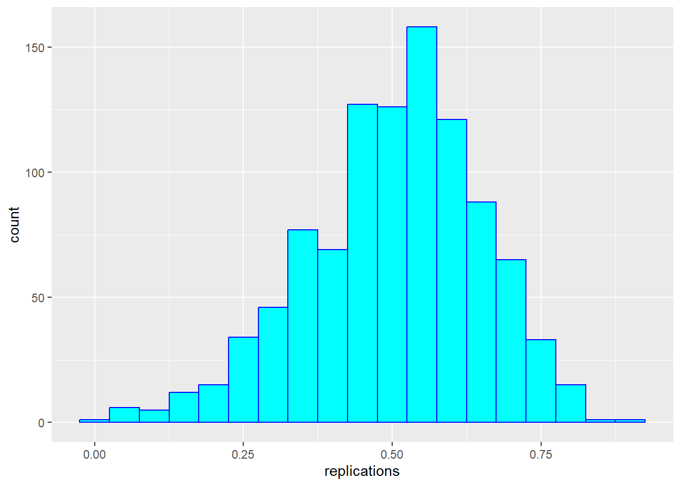
These sample correlations range from -0.002 to 0.882. Their average, however, at 0.503 is almost exactly that of the overall population. Often in data science, we will estimate population parameters in this way - by repeated sampling, and by studying the extent to which results are consistent across samples. More on that later.
17.1.2 from correlation to regression
In bivariate analysis, there is often an asymmetry between the two variables - one is often considered the predictor (or independent variable, typically x) and the other the response (or dependent variable, y). In these data, we are likely to consider the father’s height as the predictor and the son’s height as the response.
As noted above, one way of thinking about a correlation between variables like heights of fathers (x) and sons (y), is that for every one standard deviation increase in x (father’s height), we expect the son’s height to increase by about \(r\) times the standard deviation of y (the son’s height). We can compute all of these things manually and plot the points with a regression line. (We use the pull function to extract the values from the statistics from tibbles into single values).
mu_x <- galton_heights |> summarise(mean(father)) |> pull()
mu_y <- galton_heights |> summarise(mean(son)) |> pull()
s_x <- galton_heights |> summarise(sd(father)) |> pull()
s_y <- galton_heights |> summarise(sd(son)) |> pull()
r <- galton_heights %>% summarize(cor(father, son))  |> pull ()

m <-  r * s_y / s_x
b <- mu_y - m*mu_x

galton_heights %>%
  ggplot(aes(father, son)) +
  geom_point(alpha = 0.5) +
geom_abline(intercept = b, slope = m, col = "blue") 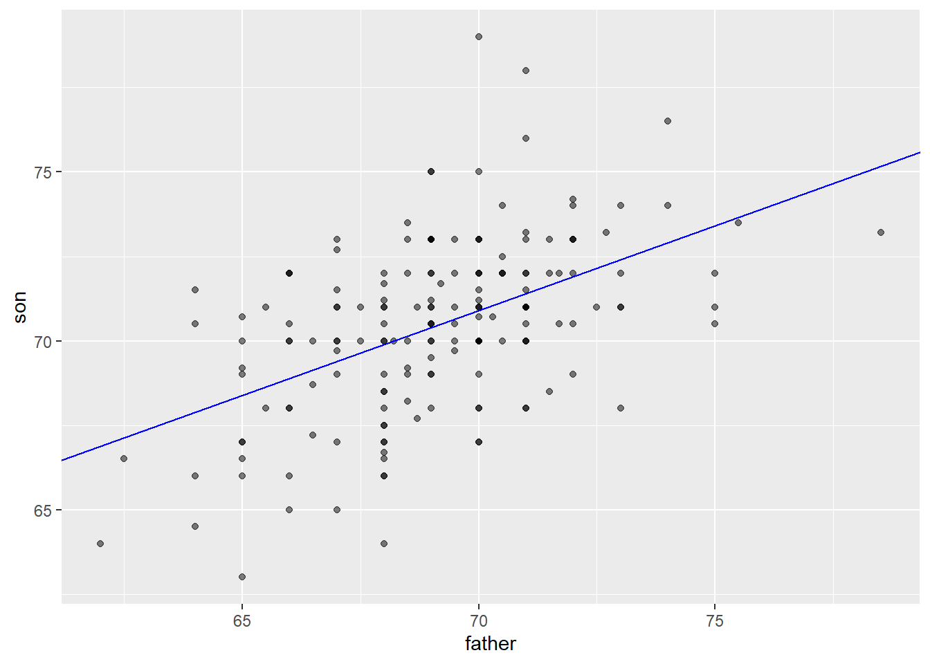
Finally, if we first standardize the variables, then the regression line has intercept 0 and slope equal to the correlation \(\rho\). Here, the slope, regression line, and correlation are all equal (I’ve made the plot square to better indicate this).
galton_heights %>%
  ggplot(aes(scale(father), scale(son))) +
  geom_point(alpha = 0.5) +
geom_abline(intercept = 0, slope = r, col = "blue") 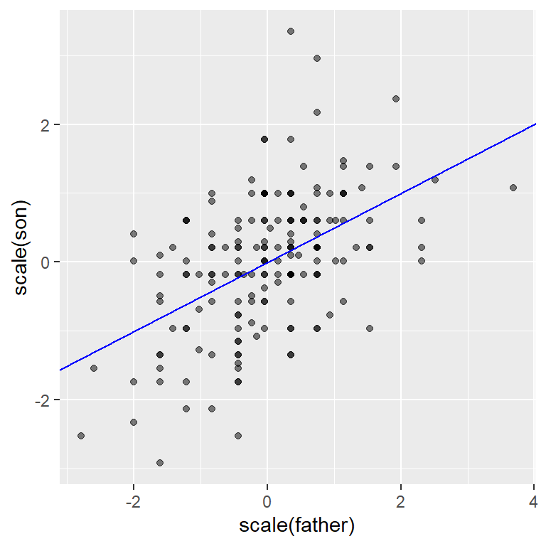
17.2 from bivariate to multivariate analysis
For the Galton data, we examined the relationship between two variables - one a predictor (father’s height) and the other a response (son’s height). In this section (drawn from Peng, Caffo, and Leek’s treatment from Coursera - the Johns Hopkins Data Science Program), we will extend our analysis to consider multiple predictors of a single response or outcome variable. You may need to install the packages “UsingR”, “GGally” and/or”Hmisc”.
We begin with a second dataset. You can learn about it by typing ?swiss in the console.
## 'data.frame':    47 obs. of  6 variables:
##  $ Fertility       : num  80.2 83.1 92.5 85.8 76.9 76.1 83.8 92.4 82.4 82.9 ...
##  $ Agriculture     : num  17 45.1 39.7 36.5 43.5 35.3 70.2 67.8 53.3 45.2 ...
##  $ Examination     : int  15 6 5 12 17 9 16 14 12 16 ...
##  $ Education       : int  12 9 5 7 15 7 7 8 7 13 ...
##  $ Catholic        : num  9.96 84.84 93.4 33.77 5.16 ...
##  $ Infant.Mortality: num  22.2 22.2 20.2 20.3 20.6 26.6 23.6 24.9 21 24.4 ...
Here’s a scatterplot matrix of the Swiss data. Look at the first column of plots (or first row of the correlations). What is the relationship between fertility and each of the other variables?
# ds_theme_set()
set.seed(0)
ggpairs (swiss,
        lower = list(
            continuous = "smooth"),
        axisLabels ="none",
        switch = 'both')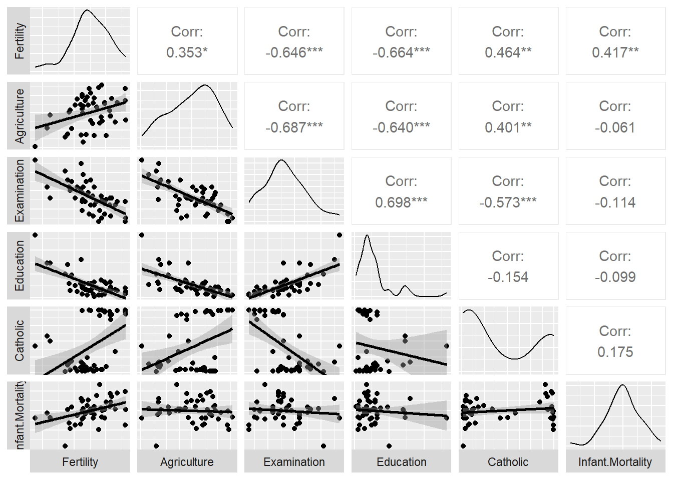
Here, we predict fertility from all of the remaining variables together in a single regression analysis, using the lm (linear model) command. Note that the result of this analysis is a list. We can pull out the key features of the data using the summary() command.
##
## Call:
## lm(formula = Fertility ~ ., data = swiss)
##
## Residuals:
##      Min       1Q   Median       3Q      Max
## -15.2743  -5.2617   0.5032   4.1198  15.3213
##
## Coefficients:
##                  Estimate Std. Error t value Pr(>|t|)
## (Intercept)      66.91518   10.70604   6.250 1.91e-07 ***
## Agriculture      -0.17211    0.07030  -2.448  0.01873 *
## Examination      -0.25801    0.25388  -1.016  0.31546
## Education        -0.87094    0.18303  -4.758 2.43e-05 ***
## Catholic          0.10412    0.03526   2.953  0.00519 **
## Infant.Mortality  1.07705    0.38172   2.822  0.00734 **
## ---
## Signif. codes:  0 '***' 0.001 '**' 0.01 '*' 0.05 '.' 0.1 ' ' 1
##
## Residual standard error: 7.165 on 41 degrees of freedom
## Multiple R-squared:  0.7067, Adjusted R-squared:  0.671
## F-statistic: 19.76 on 5 and 41 DF,  p-value: 5.594e-10
The coefficients in the “Estimate” column show the direction and nature of relations between the five predictors and Fertility after holding all other variables constant. So, Education, and to a lesser extent Agriculture, have negative relationships with Fertility and Catholicism has a positive correlation. Examination is not a significant predictor when all variables are included in the model (despite having a negative correlation initially in the scatterplot matrix shown above. ., - that is
Regression is a powerful tool for understanding the relationship between a response variable and one or more predictor variables. We can use it where our variables are not normally distributed, as in the case of dichotomous variables (yes/no, true/false), as well as counts, which often are skewed.
17.3 different forms of regression
We can do a lot with regression and the general linear model upon which it is based. Consider the following approach to prediction, which is adapted from Appendix E of the Modern text.
Consider that we want to predict usage of a recreational trail (volume) from a series of predictors, including the weather (hightemp), and the day of the week (weekend vs weekday). The data are from the RailTrail data set in the mosaic package. We can begin by looking at the mean (and standard deviation) for volume.
## Rows: 90
## Columns: 11
## $ hightemp   <int> 83, 73, 74, 95, 44, 69, 66, 66, 80, 79, 78, 65, 41, 59, 50,…
## $ lowtemp    <int> 50, 49, 52, 61, 52, 54, 39, 38, 55, 45, 55, 48, 49, 35, 35,…
## $ avgtemp    <dbl> 66.5, 61.0, 63.0, 78.0, 48.0, 61.5, 52.5, 52.0, 67.5, 62.0,…
## $ spring     <int> 0, 0, 1, 0, 1, 1, 1, 1, 0, 0, 0, 1, 1, 0, 0, 1, 0, 1, 1, 0,…
## $ summer     <int> 1, 1, 0, 1, 0, 0, 0, 0, 1, 1, 1, 0, 0, 0, 0, 0, 1, 0, 0, 0,…
## $ fall       <int> 0, 0, 0, 0, 0, 0, 0, 0, 0, 0, 0, 0, 0, 1, 1, 0, 0, 0, 0, 1,…
## $ cloudcover <dbl> 7.6, 6.3, 7.5, 2.6, 10.0, 6.6, 2.4, 0.0, 3.8, 4.1, 8.5, 7.2…
## $ precip     <dbl> 0.00, 0.29, 0.32, 0.00, 0.14, 0.02, 0.00, 0.00, 0.00, 0.00,…
## $ volume     <int> 501, 419, 397, 385, 200, 375, 417, 629, 533, 547, 432, 418,…
## $ weekday    <lgl> TRUE, TRUE, TRUE, FALSE, TRUE, TRUE, TRUE, FALSE, FALSE, TR…
## $ dayType <chr> "weekday", "weekday", "weekday", "weekend", "weekday", "wee…## mean(volume) sd(volume)
## 1 375.4 127.4626The mean of a variable is your best guess of scores on that variable. It is what we predict if we know nothing else, and so in prediction it can be considered the null model.
Section E.1.2 of the Modern text illustrates how we can construct and visualize a series of models. The first figure compares the null model with prediction from hightemp alone:
my_lm <- function(data, formula) { # native pipe fills in first unnamed argument
  lm(formula, data)
}
mod_avg <- RailTrail |>
  my_lm(volume ~ 1) |>
  augment(RailTrail)
mod_temp <- RailTrail |>
  my_lm(volume ~ hightemp) |>
  augment(RailTrail)
mod_data <- bind_rows(mod_avg, mod_temp) |>
  mutate(model = rep(c("null", "slr"),
                     each = nrow(RailTrail)))
In each plot, the vertical lines show our errors of prediction around the regression line (which is flat for the null model).
, and sloping for the . The sum of these squared errors
blue line shows our initial prediction:
ggplot(data = mod_data, aes(x = hightemp, y = volume)) +
  geom_smooth(
    data = filter(mod_data, model == "null"),
    method = "lm", se = FALSE, formula = y ~ 1,
    color = "dodgerblue", linewidth = 0.5
  ) +
  geom_smooth(
    data = filter(mod_data, model == "slr"),
    method = "lm", se = FALSE, formula = y ~ x,
    color = "dodgerblue", linewidth = 0.5
  ) +
  geom_segment(
    aes(xend = hightemp, yend = .fitted),
    arrow = arrow(length = unit(0.1, "cm")),
    linewidth = 0.5, color = "darkgray"
  ) +
  geom_point(color = "dodgerblue") +
  facet_wrap(~model)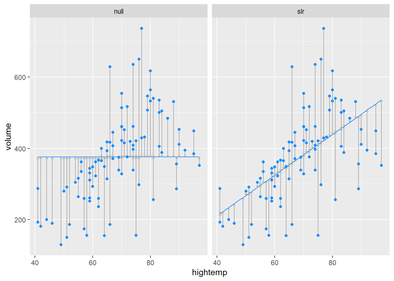
A “parallel slopes” model includes predictions from both hightemp and weekday vs. weekend.
mod_parallel <- lm(volume ~ hightemp + weekday, data = RailTrail)
mod_parallel |>
  augment() |>
  ggplot(aes(x = hightemp, y = volume, color = weekday)) +
  geom_point() +
  geom_line(aes(y = .fitted)) +
  labs(color = "Is it a\nweekday?")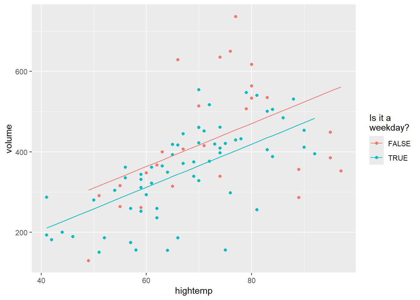
The final model allows an interaction as well as the two main effects:
mod_interact <- lm(volume ~ hightemp + weekday + hightemp * weekday,
  data = RailTrail)
mod_interact |>
  augment() |>
  ggplot(aes(x = hightemp, y = volume, color = weekday)) +
  geom_point() +
  geom_line(aes(y = .fitted)) +
  labs(color = "Is it a\nweekday?")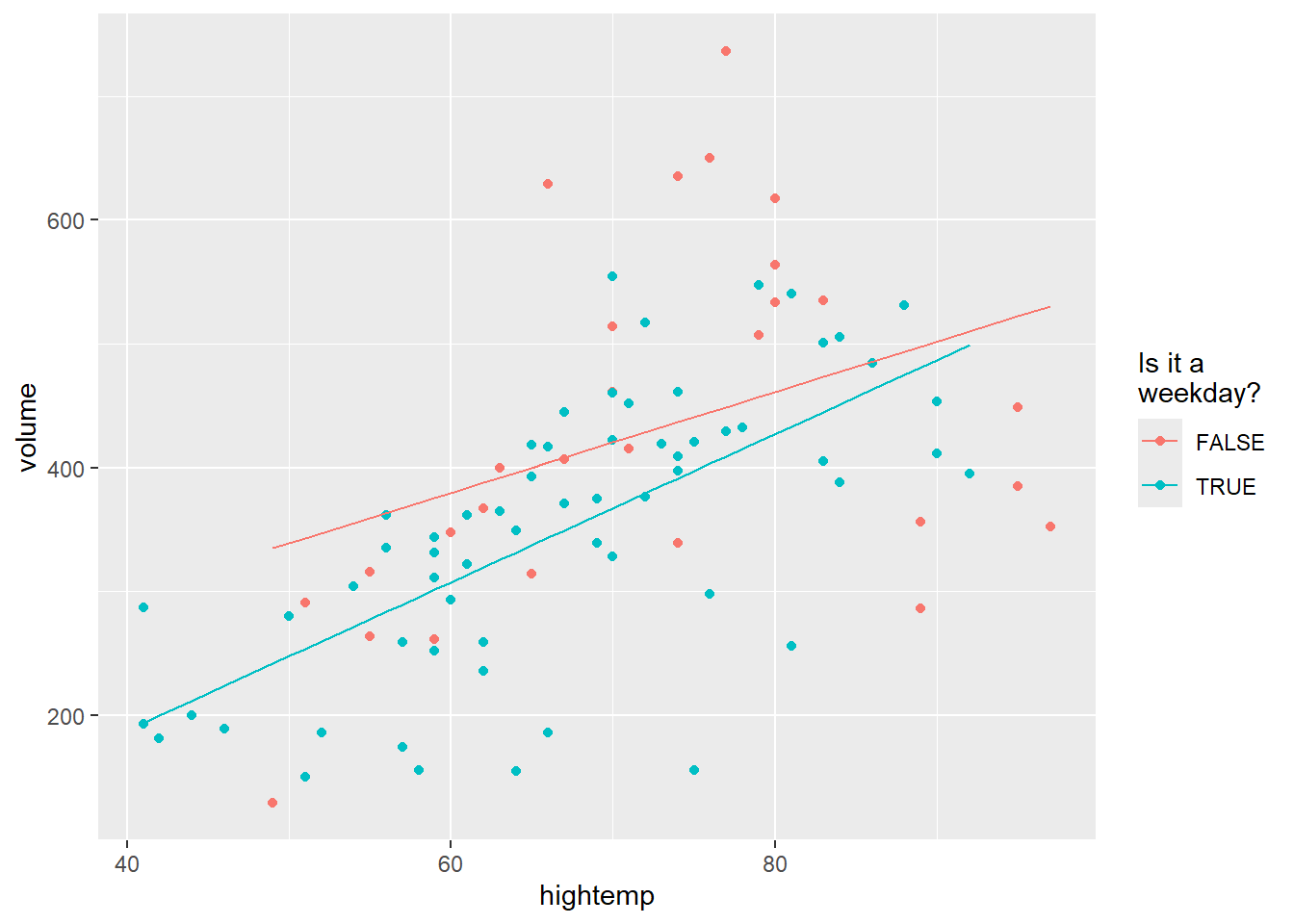
The four models are presented here, together with summary statitsics.
## # A tibble: 1 × 5
##   term        estimate std.error statistic  p.value
##   <chr>          <dbl>     <dbl>     <dbl>    <dbl>
## 1 (Intercept) 375. 13.4 27.9 7.86e-46## # A tibble: 2 × 5
## term estimate std.error statistic p.value
## <chr> <dbl> <dbl> <dbl> <dbl>
## 1 (Intercept) -17.1 59.4 -0.288 0.774
## 2 hightemp 5.70 0.848 6.72 0.00000000171## # A tibble: 3 × 5
## term estimate std.error statistic p.value
## <chr> <dbl> <dbl> <dbl> <dbl>
## 1 (Intercept) 42.8 64.3 0.665 0.508
## 2 hightemp 5.35 0.846 6.32 0.0000000109
## 3 weekdayTRUE -51.6 23.7 -2.18 0.0321## # A tibble: 4 × 5
## term estimate std.error statistic p.value
## <chr> <dbl> <dbl> <dbl> <dbl>
## 1 (Intercept) 135. 108. 1.25 0.215
## 2 hightemp 4.07 1.47 2.78 0.00676
## 3 weekdayTRUE -186. 129. -1.44 0.153
## 4 hightemp:weekdayTRUE 1.91 1.80 1.06 0.292